About the Project

New York City (NYC) is a global hub for diverse cuisine, offering an extensive range of dining experiences that reflect cultures from around the world. With more than 13,000 restaurants currently operating across the five boroughs, a robust food establishment inspection program is essential to maintaining consistent food safety standards and protecting public health.
This project explores restaurant inspection outcomes across New York City through an interactive dashboard that highlights recent inspection results, spatial patterns, and long-term trends, using historical inspection data spanning 2007 through March 2026.
The project focused on building an interactive ArcGIS Dashboard and StoryMap while applying key geospatial concepts and developing skills in data analysis, visual design, and communicating spatial information.
The interactive map allows users to explore restaurant locations and inspection grades, while dynamic dashboard elements update as the map extent changes, supporting analysis at multiple spatial scales. Additional visualizations, including grade distributions, tabular data, and time series charts, provide both aggregate and restaurant-level insights. Users can filter the dataset by grade and borough or select individual restaurants to examine inspection score trends over time.
The workflow involved filtering and organizing the dataset to isolate the most recent inspection results for display on the web map while preserving historical records for temporal analysis. Restaurant locations were displayed as individual points rather than aggregated, preserving important spatial patterns in density and distribution across New York City.
Integrating the web map into the dashboard enabled dynamic, view- and selection-based interactions via linked charts, tables, and filters, allowing users to explore relationships within the dataset in a more exploratory, interactive manner.
The dashboard was subsequently embedded within an ArcGIS StoryMap, providing additional context for the dataset and communicating key findings through written interpretation of the spatial and temporal patterns identified throughout the analysis.
Data Sources and Dataset Details
The dataset used in this project is derived from restaurant inspection records provided by New York City’s Department of Health and Mental Hygiene (DOHMH) and is publicly available on the NYC Open Data portal.
This dataset was chosen for its strong relevance to public health and daily life, as well as its suitability for spatial analysis. It provides up-to-date restaurant inspection outcomes across New York City, offering insight into the conditions of dining establishments visited by the public. Importantly, it enables analysis of inspection performance over time, highlighting trends in compliance with established health standards.
The DOHMH New York City Restaurant Inspection Results dataset is updated daily and, at the time of download in late March, contained over 290,000 inspection records spanning multiple years of restaurant inspection activity across New York City, from 2007 through March 2026.
The original CSV included several records with missing coordinate pairs or placeholder data (1/1/1900), representing establishments that have not yet received an inspection(DOHMH, 2026). These records were removed during data preparation to ensure data consistency and ease of subsequent analysis. Additional data cleaning tasks included standardizing text fields to proper case, thereby improving consistency and readability in the dashboard UI elements.
Two cleaned datasets were created for this project. The first dataset (NYC_Restaurant_Latest), used in the dashboard’s map view, includes only the most recent inspection result for each uniquely identified restaurant (CAMIS). The second (NYC_Restaurant_Full), more comprehensive dataset retains all available inspection records for each CAMIS and is used to visualize score performance over time.
Key Dashboard Components
The Map View
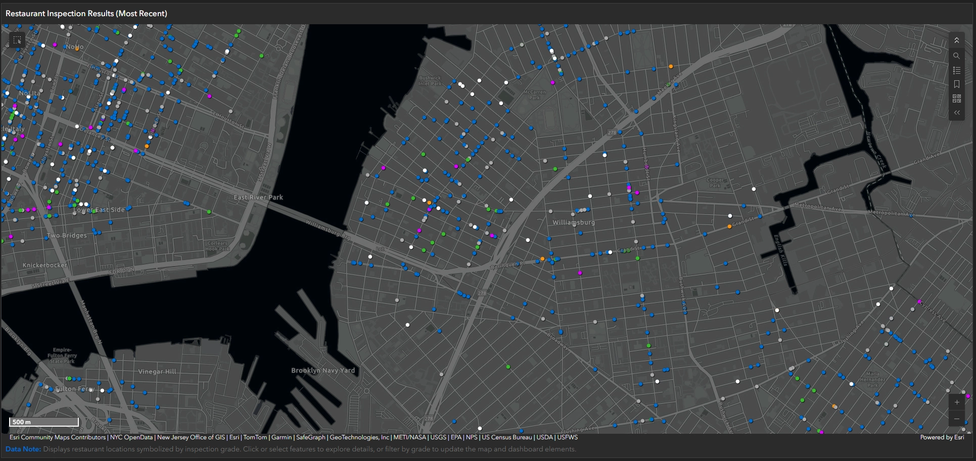
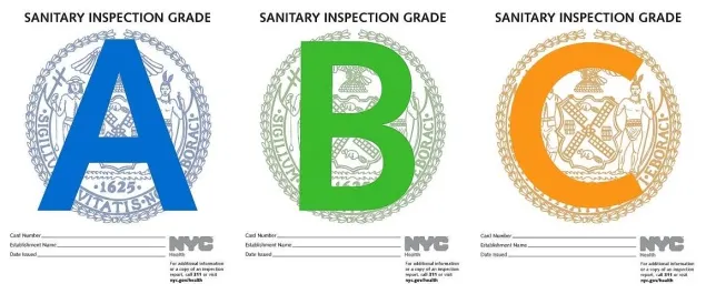
The map view serves as the spatial foundation of the dashboard, displaying plotted points for each restaurant in the most recent inspection dataset (NYC_Restaurant_Latest), symbolized by the most recent inspection grade. A custom basemap, derived from Esri’s Dark Gray Canvas, was used to provide a more refined visual backdrop, with borough polygons added to clarify the dataset’s spatial extent. As the user zooms in, the individual points become labelled with the restaurant name. The primary colours—blue (Grade A), green (Grade B), and orange (Grade C)—were derived from sampled NYC letter-grade signage. Distinct colours were applied to grades Z (Pending) and N (Not Graded), using a brighter tone and a more subdued tone, respectively, to clearly differentiate them from standard grading symbology. This map allows users to explore geographic patterns in restaurant performance and serves as the primary interface for interacting with and filtering the dataset.
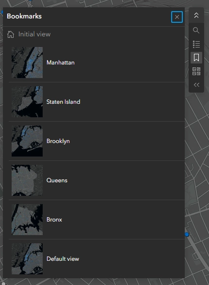
The map view also includes various toggleable functions, including search (geocoding), a map legend, bookmarks for the five boroughs and the default view, a basemap selector, GPS pinpointing, and zoom controls.
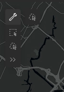
Spatial selection tools are available within the map view, including rectangle and lasso selection methods. The lasso tool is particularly effective for isolating irregular geographic areas, such as borough boundaries, enabling more precise and flexible spatial filtering than standard selection methods.
Restaurant Grade Breakdown (Current Map View)
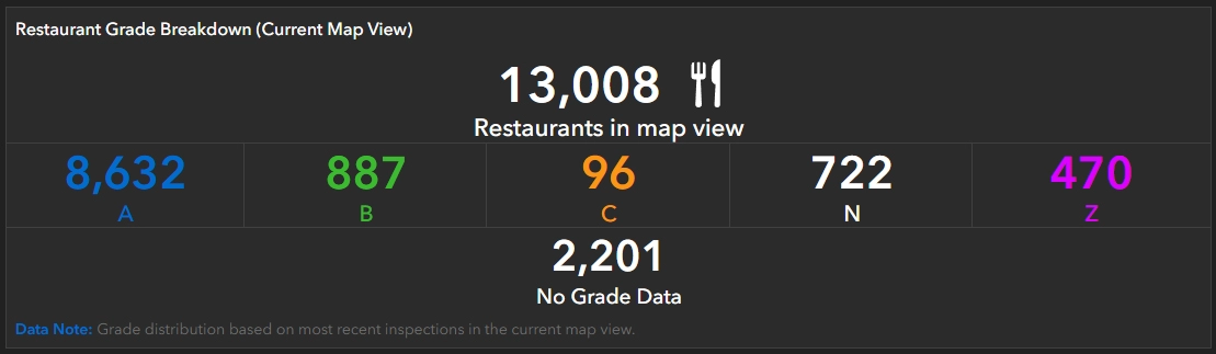
The Restaurant Grade Breakdown (Current Map View) provides a summary of total restaurant counts, identified by CAMIS, within the current map extent. This element dynamically updates based on the visible map area, displaying both the total number of restaurants and the distribution of grades (A, B, and C). It also includes restaurants with Not Graded or Pending status, as well as those with No Grade Data.
Instructions Panel
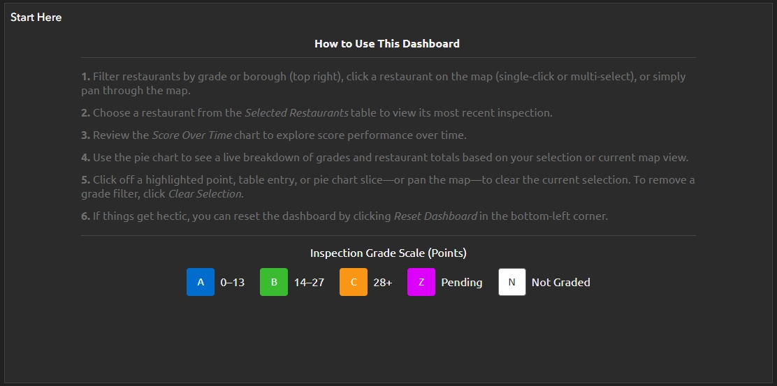
The instructions panel serves as a reminder of how to interact with the dashboard, helping users navigate key UI behaviours such as filtering restaurants by grade, selecting restaurants by point or multi-select (rectangle), and selecting entries within the Restaurants In View & Selected panel to access detailed inspection information. It also provides guidance on interpreting and using the pie chart to filter results in the current map view, reviewing the Restaurant Score Over Time serial chart, and deselecting restaurants and resetting the dashboard to its default state.
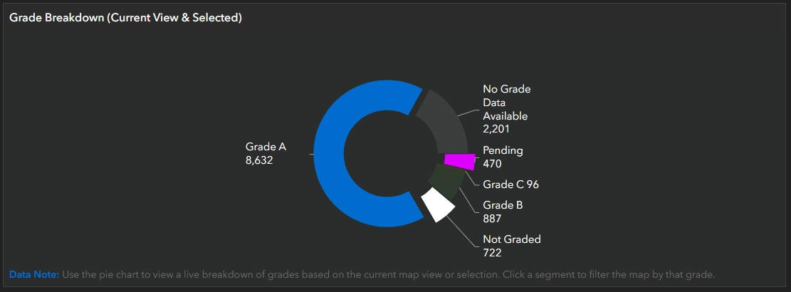
Grade Breakdown (Current View & Selected)
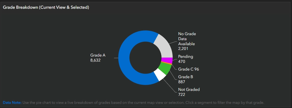
The Grade Breakdown panel includes a pie chart that dynamically updates to display the proportion of restaurants by grade within the current map view. In a dataset of over 13,000 points, many locations can overlap, so selecting a single point when zoomed out may inadvertently select multiple restaurants. Although these are listed in the Restaurants (Current View & Selected) table, the pie chart provides a clear visual summary of the selected or overlapping records.
The pie chart reflects the current map extent and selection, updating dynamically as the view or selection changes. It also includes a tertiary function that allows users to filter results by clicking one or multiple slices, which in turn updates the map view and the Restaurants (Current View & Selected) table accordingly. However, because the chart depends on the visible map extent or direct selection, filtered results will only appear within the current view; if no matching restaurants are visible, the chart will display zero values even if relevant records exist elsewhere in the dataset.
Restaurants (Current View & Selected)
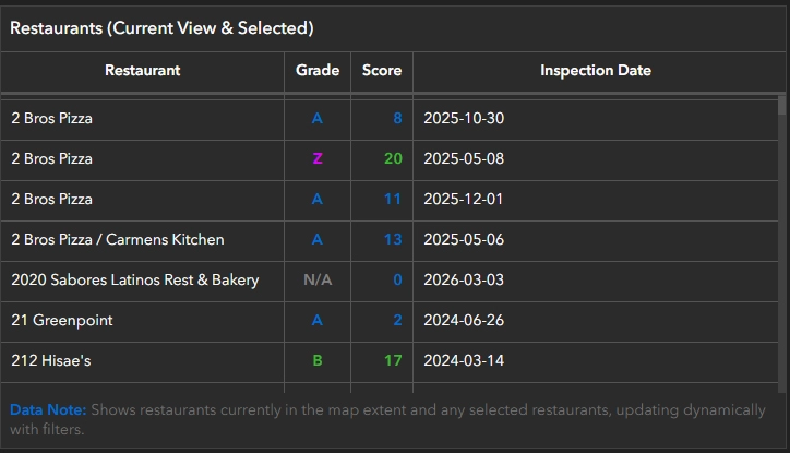
The Restaurants (Current View & Selected) panel is an alphabetical, dynamically generated, and clickable list that appears under two conditions. First, it displays restaurants currently visible within the map view. Second, it reflects restaurants selected either individually or using the rectangular selection tool. The panel includes key attributes such as restaurant name, grade, score, and most recent inspection date. Selecting a restaurant entry displays the Restaurant & Inspection Details panel and the Restaurant Score Over Time serial chart.
Restaurant & Inspection Details
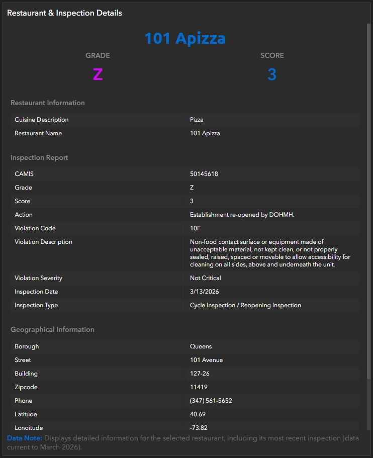
The Restaurant & Inspection Details panel is a dynamically generated, comprehensive overview of each restaurant’s key attributes that appears when a specific restaurant is selected in the Restaurants (Current View & Selected) panel. These attributes are organized into three main components: Restaurant Information, Inspection Report, and Geographical Information. The full list of fields can be seen in the screenshot above or referenced in the Data section.
Filter selections

Two toggleable filtering options are available in the top-right corner of the dashboard and can be used independently, in combination, or alongside the Grade Breakdown (Current View & Selected) pie chart. For example, when the map view spans multiple boroughs, restaurants can be filtered by borough and then further refined by grade using selectors. The Grade Breakdown pie chart dynamically summarizes restaurant totals and grade distribution based on the current map view and active filters. Together, these components enable efficient analysis of restaurant totals by both grade and borough.
Filter Restaurants by Grade Selection: Allows users to filter restaurants within the current map extent by inspection grade (A, B, C, Z, N), either individually or in combination. Restaurants (Current View & Selected) table updates to display only locations that meet the selected grade criteria within the visible map area. To reset the view, users can simply deselect the active filter(s).
Filter Restaurants by Borough: Allows users to filter restaurants in the map view based on borough.
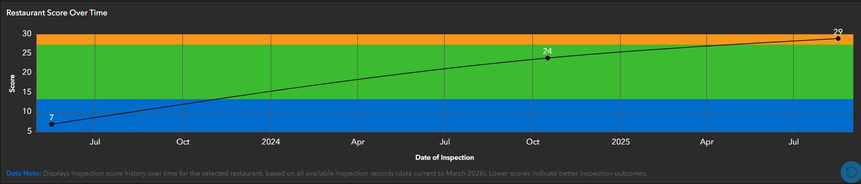
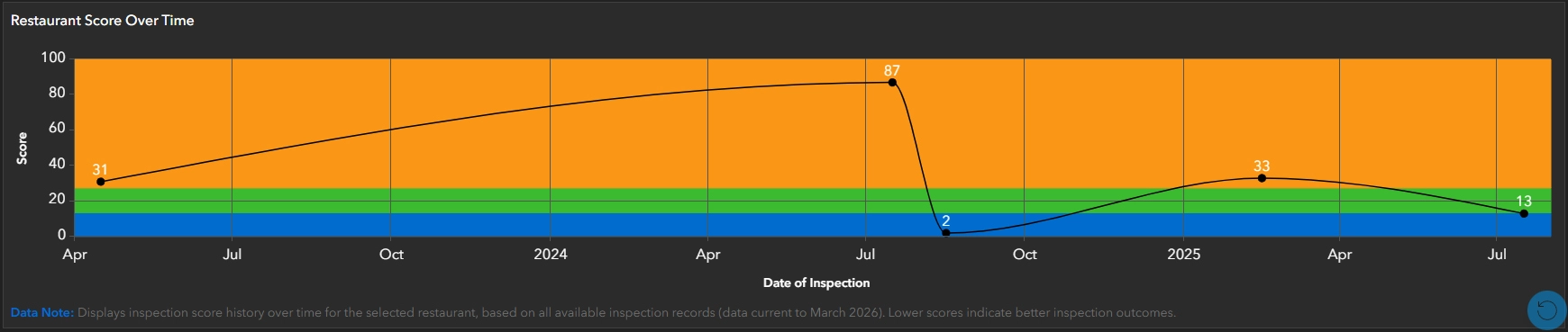
Restaurant Score Over Time
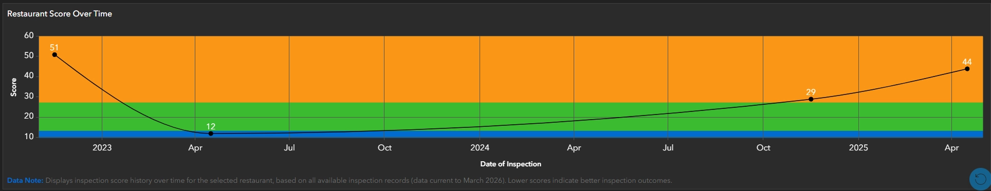
The Restaurant Score Over Time is a serial chart (displayed as a line chart) that visualizes a restaurant’s score performance over time, referencing the NYC_Restaurant_Full dataset, which includes multiple years of inspections per CAMIS. The chart plots score on the Y-axis and inspection date on the X-axis. Three value guides, aligned with the primary grade colours on the Y-axis, provide an intuitive and immediate understanding of each inspection score and its corresponding grade, with each inspection represented by a black dot. To further enhance this understanding, each inspection instance is labelled with its corresponding score.
This chart is one of the strongest analytical components of the dashboard, providing a clear temporal perspective on restaurant performance that cannot be captured through static or aggregate views alone.
Findings & Insights
Patterns & Distribution
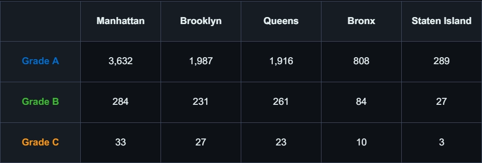
When visualizing the data, several key spatial trends emerge. The highest concentration of restaurants is observed in Manhattan, with 5,288 of 13,008 total records, reinforcing its role as the city’s primary dining hub. Other boroughs exhibit lower relative counts, resulting in more dispersed restaurant distributions and more localized patterns.
While the restaurant counts vary significantly by borough, the trend does not appear to be correlated to population alone. For example, the estimated population of Manhattan in 2020 was 1,694,251—the second-lowest among the 5 boroughs (New York City Department of City Planning, 2024)—yet it accounted for 57.6% of NYC’s total tourism jobs (Office of the New York State Comptroller, 2021). This suggests that restaurant density is likely influenced by tourism and commercial activity, which increases demand for dining establishments beyond what the resident population alone would indicate.
Further, Table 1 demonstrates that boroughs with higher restaurant density, particularly Manhattan, also exhibit higher counts across all inspection grades. This pattern reflects overall restaurant volume rather than performance differences, showing that higher density increases total inspection counts without indicating a decline in sanitary conditions.
Temporal Trends
A review of restaurant inspection scores over time using the Restaurant Score serial chart reveals that performance is dynamic. While some establishments maintain relatively consistent scores across multiple inspections, others exhibit noticeable fluctuations, with scores improving or declining between inspection periods. As shown in Figure 11, some restaurants demonstrate gradual increases in inspection scores over time, indicating declining performance.
These variations suggest that compliance with food safety standards can change over time rather than remaining constant. The temporal visualization highlights how individual restaurant performance evolves, providing important context beyond a single inspection result and reinforcing the value of temporal analysis when evaluating food safety outcomes. In contrast, Figure 12 illustrates high variability in inspection outcomes, with significant fluctuations between inspection periods.
Interaction Insights
The dashboard’s interactive map view directly influences how the dataset is interpreted, as summary statistics, grade distributions, and tabular information update dynamically based on the current map extent. As users pan and zoom across the city, the subset of data being visualized changes, revealing patterns that may not be apparent at a city-wide level.
This relationship between map extent and data output demonstrates that interpretation varies with scale: broader views highlight overall trends, while more focused views reveal finer spatial variation. Filtering and selection tools, including grade and borough filters as well as rectangle and lasso selection, further enhance analysis by isolating specific subsets of the data.
Data & Dashboard Limitations
The following limitations were identified during the development and use of the dashboard:
- Multiple restaurants located at the same or adjacent addresses are often plotted at the same geographic point, which can lead to potential interpretation challenges when interacting with the map. However, this limitation is effectively addressed through the Restaurants (Current View & Selected) and Grade Breakdown (Current Map View) panels, which summarize both selected and visible records. As a result, regardless of point overlap within the map view, the true number of restaurants is accurately represented through the dashboard’s UI elements.
- ArcGIS Dashboards does not currently provide a dedicated dataset search function, which limits the ability to efficiently locate specific restaurant inspections within large datasets. As the dataset size increases, alternative methods such as categorical filtering return large result sets, which can degrade performance and responsiveness, ultimately affecting usability.
- There is a clear distinction between filtered results and selected results. Filters, such as by grade or borough do not directly select results, and therefore will not update the pie chart summary unless those restaurants fall within the current map view.
Future Improvements
The following enhancements could improve the functionality and usability of the dashboard:
- Public Deployment: If deployed publicly, this dashboard could leverage the NYC Open Data API to provide near-real-time updates of restaurant inspection results, enabling a continuously updated view of inspection activity across New York City.
- Enhanced Restaurant Score Over Time functionality: could link each point on the Restaurant Score Over Time serial chart to its corresponding inspection report, allowing users to access detailed information for individual inspections directly.
- Enhanced Search: Enhanced dataset querying. See details in Data & Dashboard Limitations.
- Filter by borough: Implementing a borough-level filter, similar to existing grade-based selectors, would allow users to isolate and compare inspection outcomes across boroughs.
Findings
From a cartographic perspective, the dashboard demonstrates how visual hierarchy, symbology, and dynamic components can help users interpret and identify meaningful patterns in a complex dataset such as the DOHMH New York City Restaurant Inspection Results.
Restaurant inspection results have a considerable impact on daily decision-making, influencing where people choose to dine based on perceived health and safety standards.
The dashboard combines an interactive map with dynamically generated content, including table summaries, grade and score breakdowns, detailed information panels, and performance-over-time serial charts. As a result, it shifts from a broad spatial overview of thousands of restaurant points to more focused, location-specific insights, highlighting core restaurant and inspection information while supporting performance trends over time.
The use of dynamic filtering and selection tools further improves usability, allowing users to explore the data intuitively and responsively based on the current map view or selection.
Ultimately, the dashboard demonstrates how effective cartographic design and interactive visualization can transform complex datasets into accessible tools that support informed, real-world decision-making.
I ♥ NY
Technology Stack
- ArcGIS Online
- ArcGIS Dashboards
- ArcGIS StoryMaps
Applied Skills
- Cleaned and prepared a multi-year inspection dataset for spatial visualization and analysis.
- Developed an interactive dashboard integrating map, chart, filtering, and table elements to enable dynamic exploration of spatial and temporal patterns.
- Conducted spatial and temporal analysis of restaurant inspection patterns to identify trends and areas of concern across New York City.
- Designed and symbolized a web map in ArcGIS Online to clearly represent restaurant inspection results and support accurate interpretation.
- Interpreted and communicated key spatial trends through a structured ArcGIS StoryMap narrative, translating complex data into clear insights.